Signs are almost always taken for granted. In class, we learned that ‘signage’ is one of the most basic and omnipresent example of visual design and interface design. The principle is the same as with any piece of design work – that it should tell a story, but in this case, the story should quite literally be told.
But if there’s one thing that is important when creating signs is that lack of clarity only contributes to visual pollution. Below are some of the examples of visual pollution around New York.
Wayfinding Gone Wrong
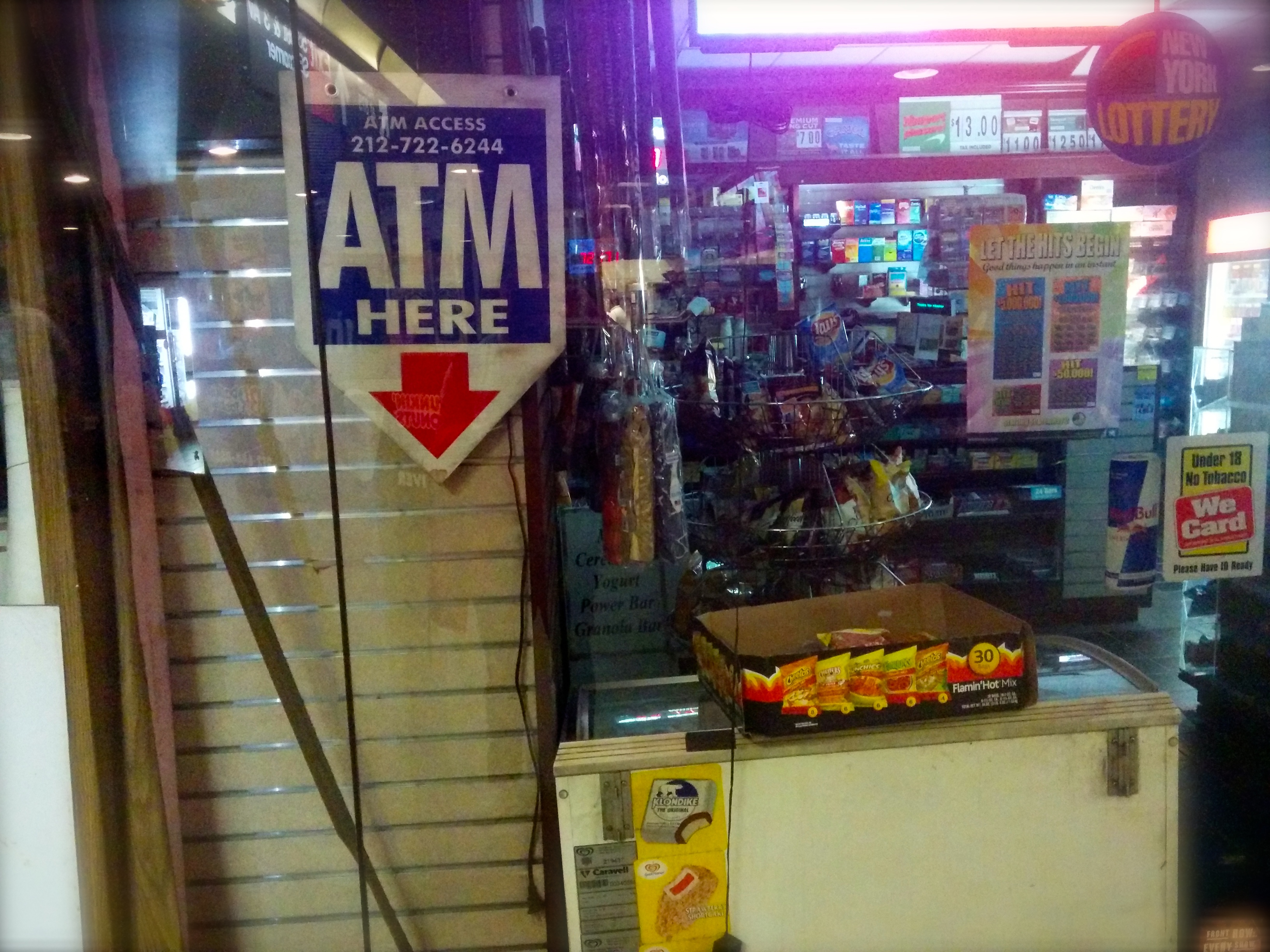
Here’s an example of a bad wayfinding signage. Be careful when using arrows. Arrows signify wayfinding and leads our eyes to follow (and find) the subject. In this example, I think the bodega just wants to promote that they have an ATM facility. If they would just drop the arrow, I would sleep better at night.

Vertical Nightmare
Vertical signs are hard to pull off because unless you’re Chinese or Korean, it is not our natural way of reading texts. In the case of the Tailoring and Cleaning shop below, they try to bunch up a ot of letters together making their sign hard to read. They got one thing right though, use bold and uppercase typeface to make reading a bit easier. Just imagine if the sign is written in lower case. Ay, ¡qué horror!

Lack of Clarity
Aside from the fact that they used horrible typography in the logo below, notice anything suspicious? Dear Styling Haircutters, how convenient, I can have my watch repaired and get a perm at the same time. Fancy.

Bad Branding /Logo Violation
As a marketer, I’m trained in the dark art of policing logo violators. Below is the perfect example. Not only did it violate the logo of the brand, the ‘styling’ doesn’t really help make the sign be attractive. Ugh.

URL Disaster
If this discount store is trying to get me to go to its website. I wont…. Okay fine, I couldn’t resist. At first I thought this was an SEO tactic that they are doing (which most businesses that drive most of their revenues from online sales do), but they’re not even on top of the search engine results page. So I question, why.

Uniformity of Ugliness
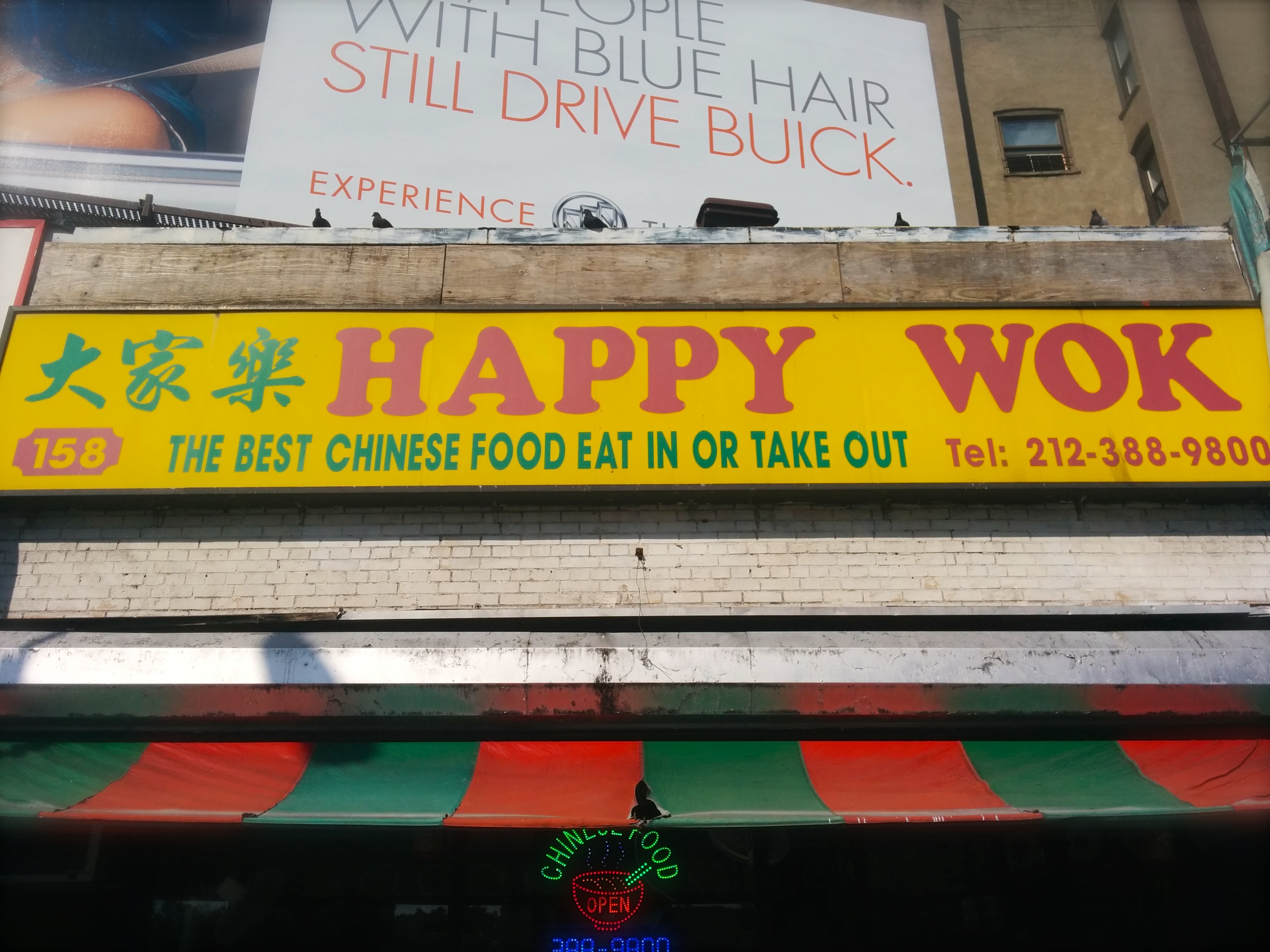
Lastly, this is more of a rant than anything — What’s up with Chinese restaurants around the city!? Do they all talk to each other and decide to create the ugliest signs and desecrate my favorite color, yellow? There must be a union of some sort! This uniformity of ugliness baffles me.


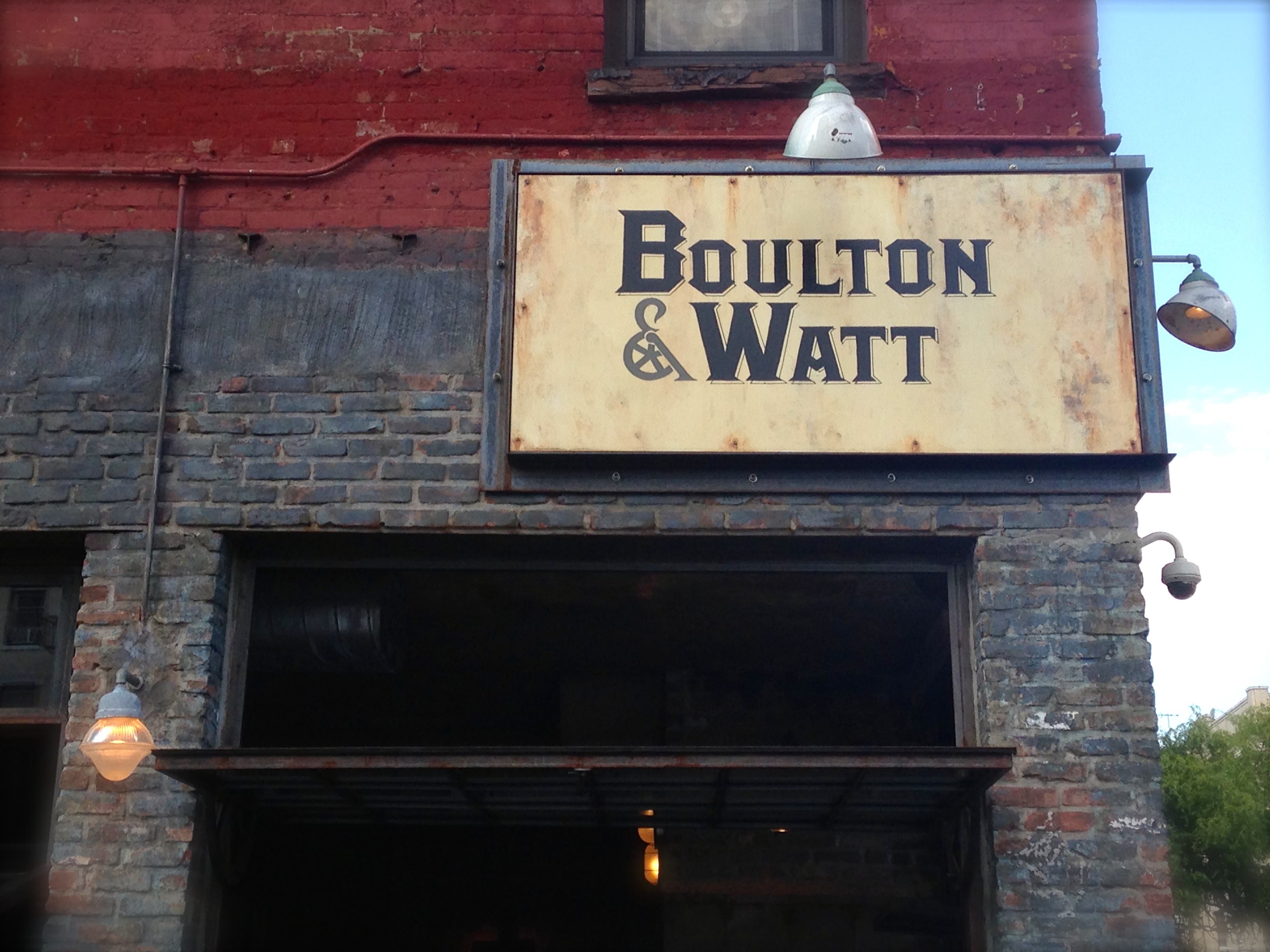
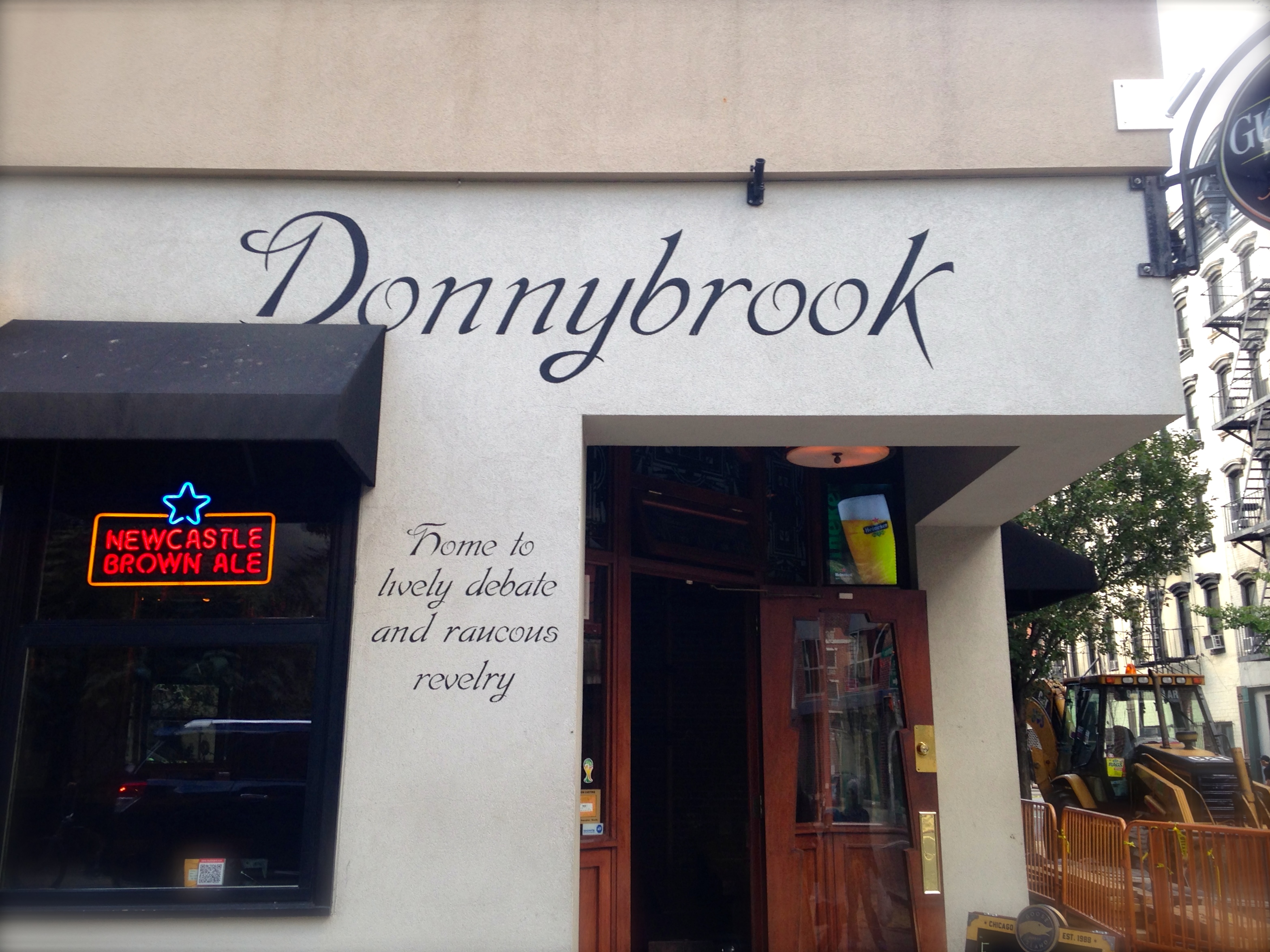
Signs I Love
Bolton & Watt – according to their website, the bar is a project forged of the passion of a group of partners working and living in the East Village, Drawing inspiration from the industrial revolution – of which Matthew Boulton & James Watt were pivotal figures with their perfection of the steam engine, which in turn catapulted two continents into a new era. I love how the design of the signage matches the interiors!
Donnybrook – home to lively debate and raucous revelry.
Happy Again
So Happy Wok (above) is my favorite Chinese Take-out place. The owner knows me by name and gives me extra dumplings because she says I smile all the time, so I figured toying around with their logo to try to set them apart from competition:
